Yami Café
Yami Cafe is a playful café identity rooted in warmth and everyday ritual. The project explores how character-driven typography and simple visual systems can build a cohesive brand experience across physical and digital touchpoints.
- ROLE
- Brand & graphic designer
- TOOL
- Figma, Illustrator, Photoshop,
Rhino 8 - TEAM
- Jinjiu Gu, Linlin Yu, Natalie Wang
- TIME
- 5 weeks · Nov 2024
The Concept
The name “Yami” draws from the warmth and grounding qualities of the yam — a humble ingredient associated with comfort and nourishment. The identity reflects this through rounded forms, earthy tones, and friendly typography. The goal was to create a brand that feels approachable, playful, and rooted in comfort.
A shape to
remember.
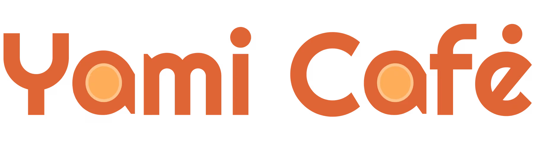
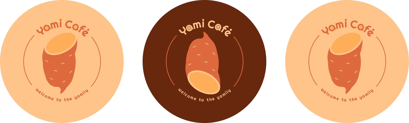
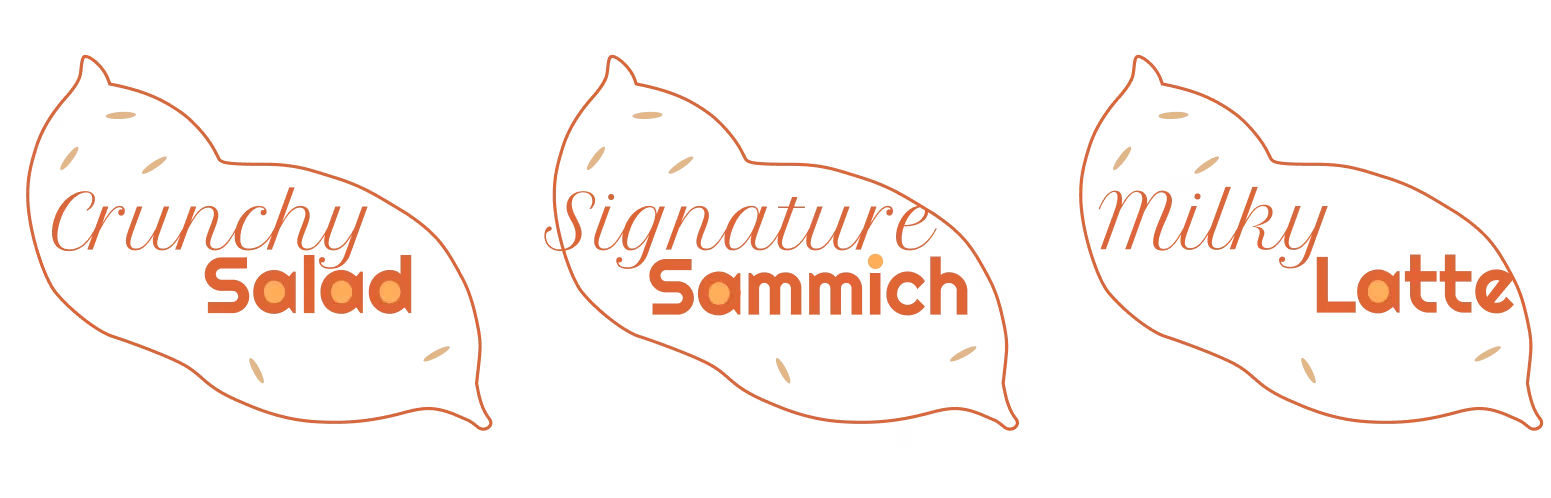
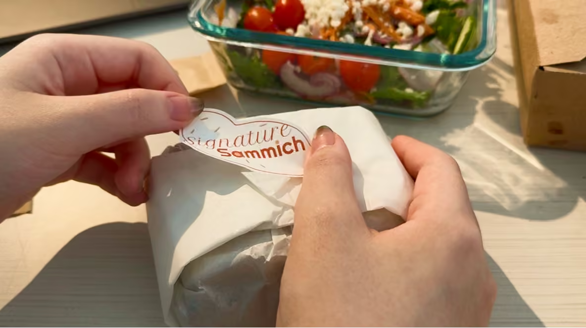
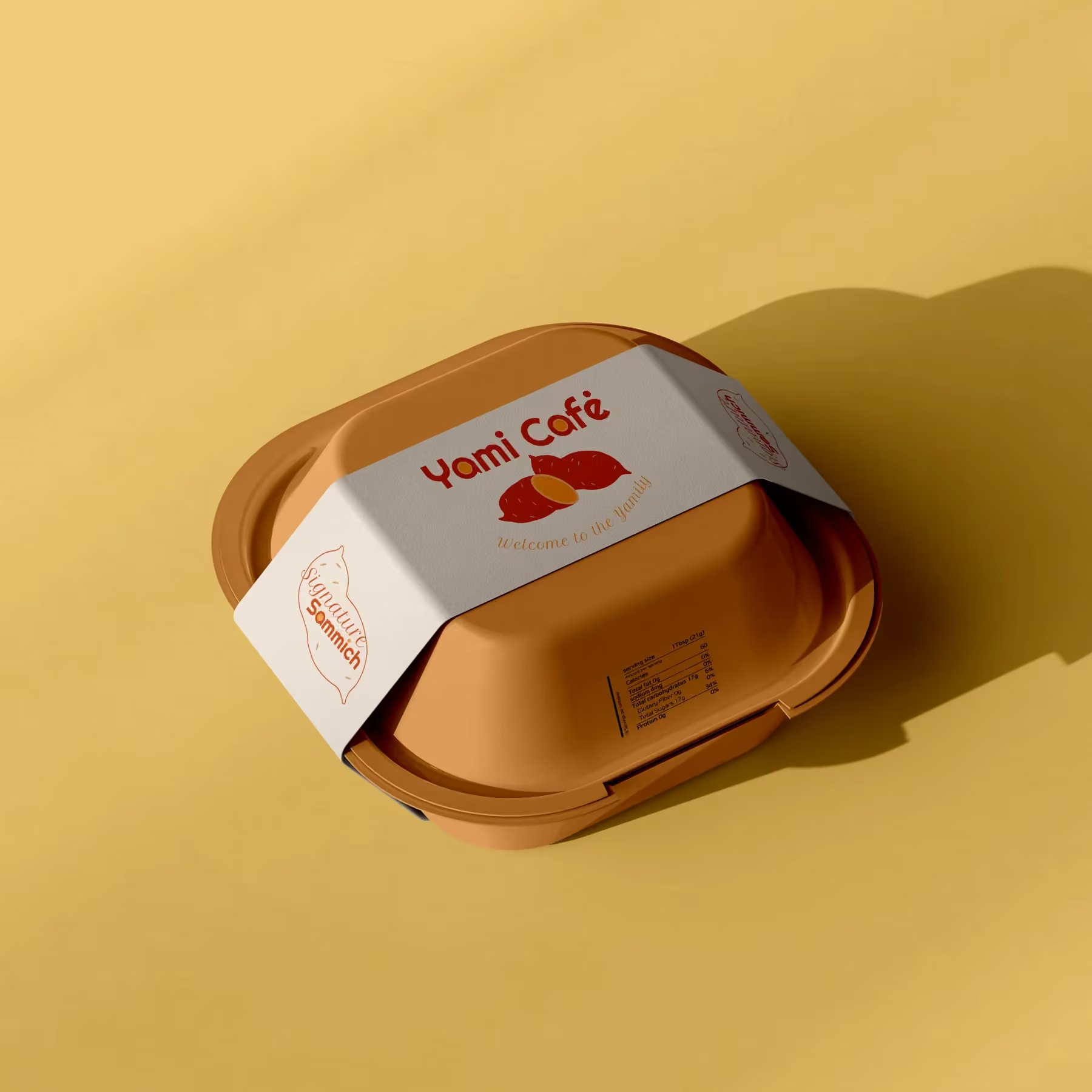
The custom wordmark brings a sliced-yam form into the lettering. Its soft proportions carry through the stickers and product labels, giving the system a recognizable voice beyond the café sign.
Logo Design

Color Palette

Brand Mark
Across touchpoints.
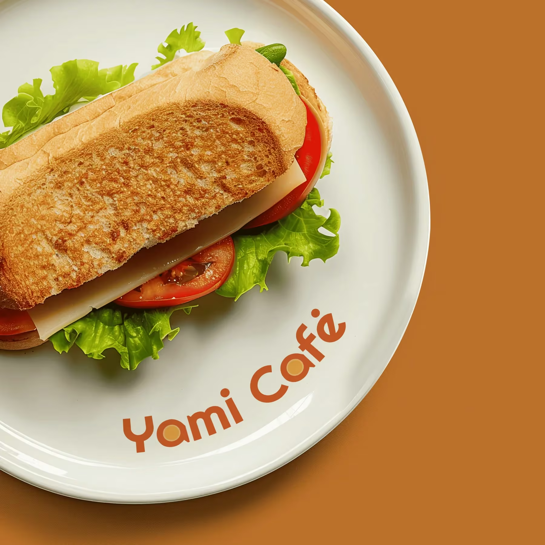
From the plate to the takeaway pack, the identity changes scale without losing its warmth. These three applications bring the system into the moments people actually touch.

Imagining the
space.
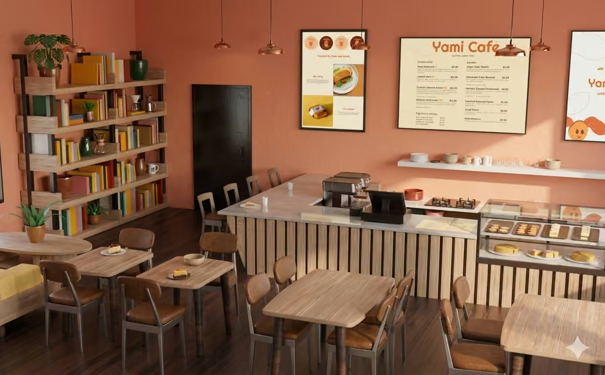
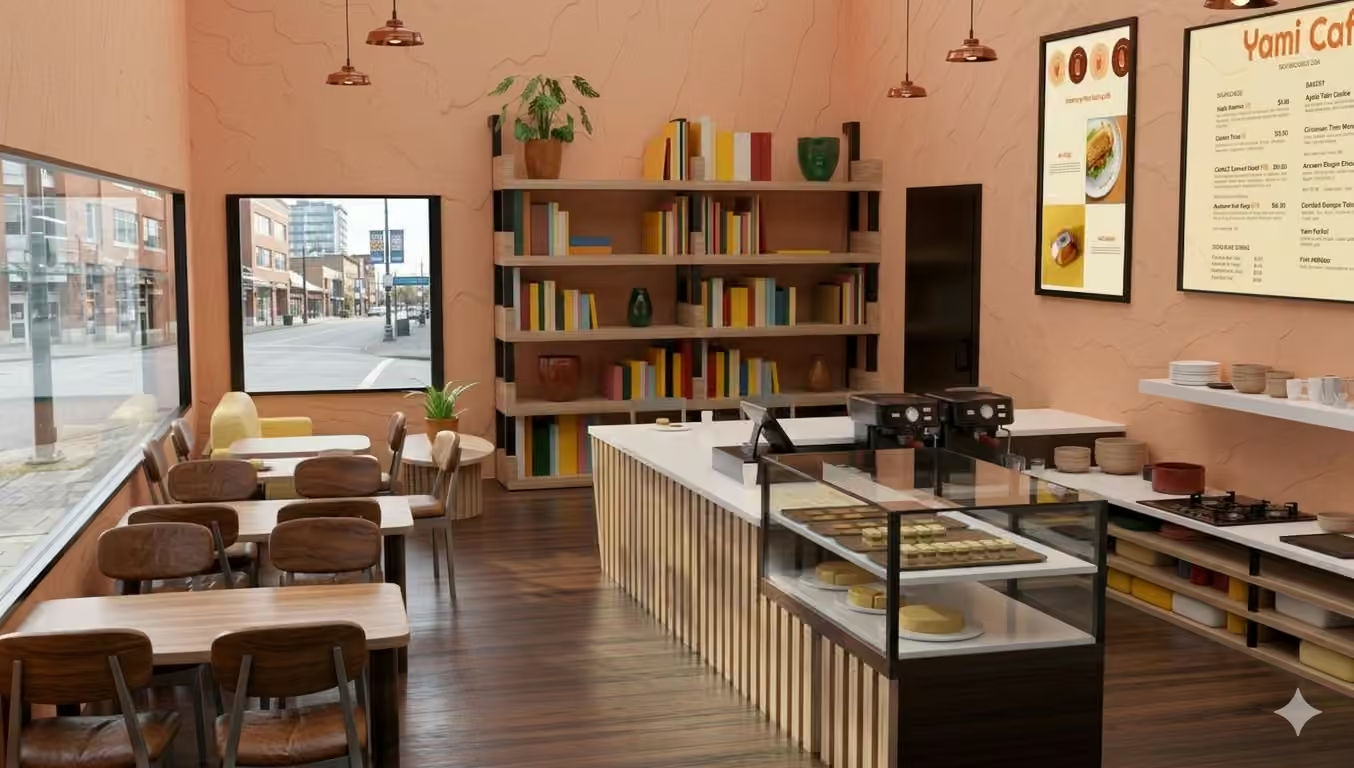
I modeled a possible café interior in Rhino 8 from our layout sketches. The visualization brings the menus, materials, and brand graphics together as one imagined customer experience.
A little warmth
goes a long way.
Yami Café gave us a chance to turn one simple ingredient into a flexible visual language. The strongest moments are the small ones: a rounded letter, a familiar color, and a mark that still feels like itself at every scale.